During the course Project Usability and UX Assessment in Design at TU Delft, my team and I collaborated with Versuni to evaluate and propose a partial app redesign.
Through a series of structured usability evaluation methods, we conducted both expert inspections and user testing sessions with participants. Rather than redesigning the entire app, the project focused on applying rigorous usability testing, generating valuable insights, and examining the legibility and effectiveness of our targeted redesign proposal.
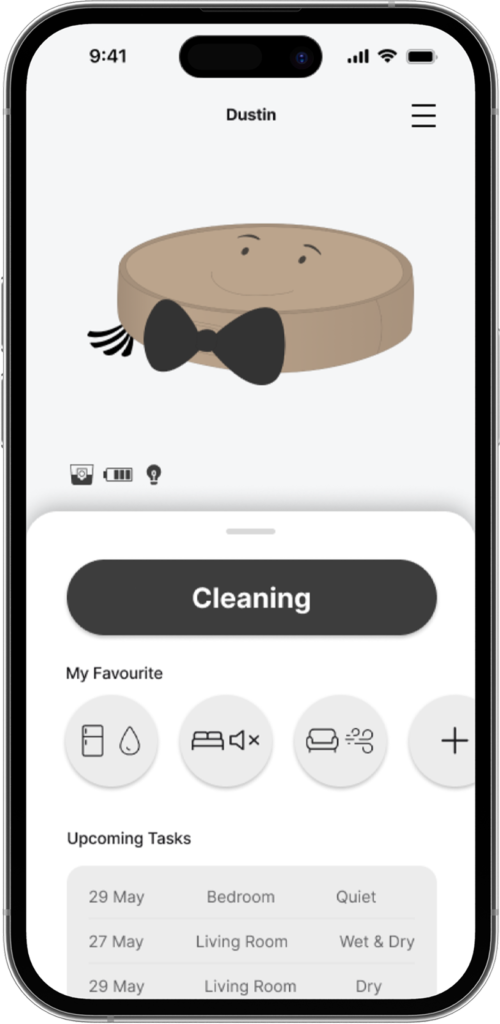
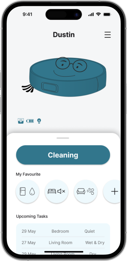
Philips’s HomeRun 7000 Series Aqua Robot Vacuum aims to create a comfortable living environment without users’ hassle of cleaning.
There is no doubt that the robot vacuum can auto-pilot itself to completely clean the floor with its powerful suction and mopping tool, multiple sensors for navigating its route and obstacles, and build up customizable cleaning options on users’ HomeRun Robot app.
Original App Build-up
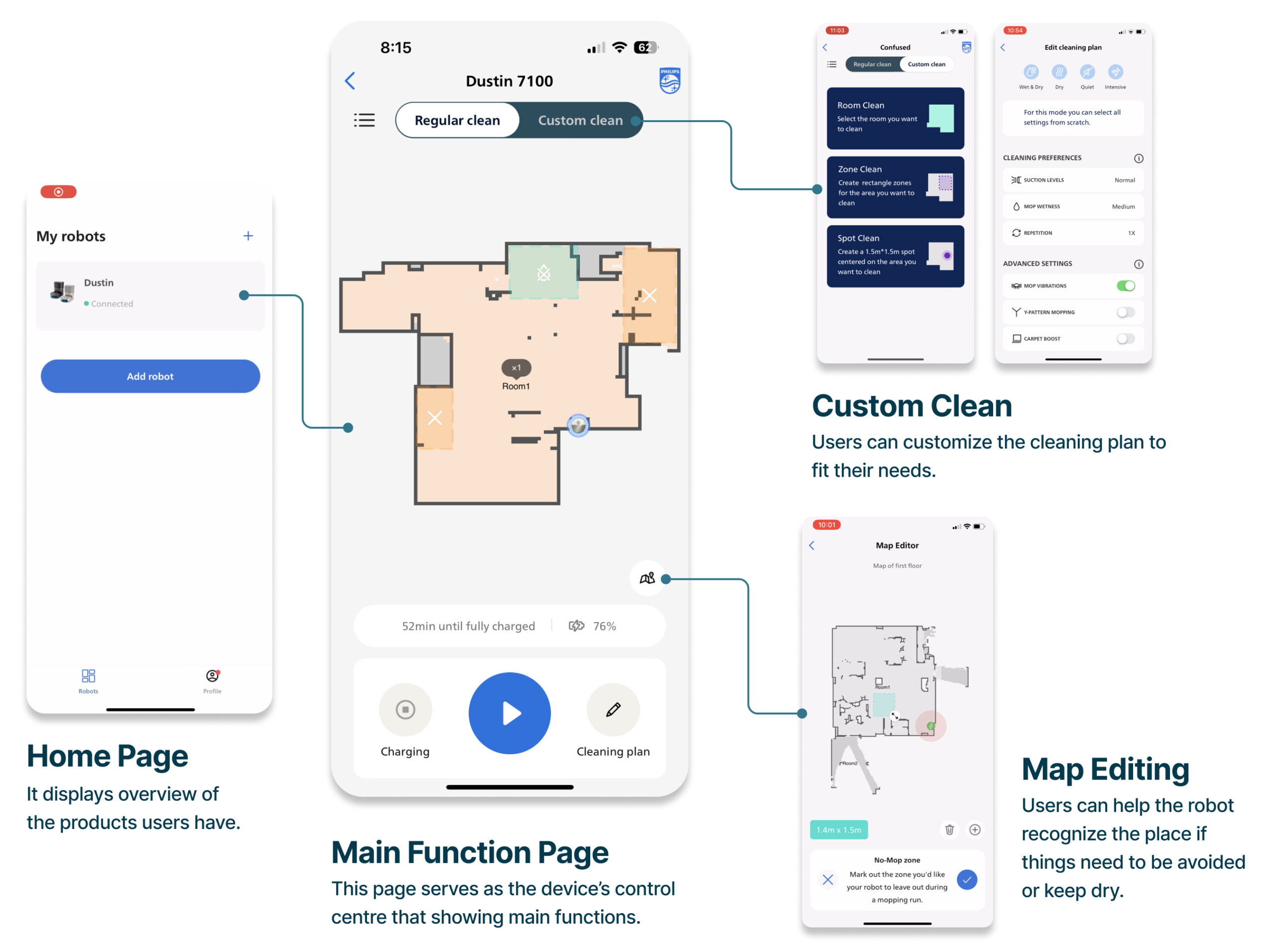
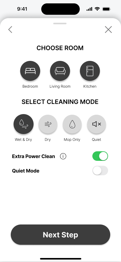
The HomeRun Robot app serves as the primary interaction point between users and the device. During setup, it is mandatory for users to pair the robot vacuum with the app, and both the device and the app need to be connected to the same Wi-Fi network.
In addition to setup, users can customize their floor cleaning plan according to their needs using the app. From creating cleaning schedules to cleaning specific areas in specific ways, this app offers users a prominent level of autonomy in controlling the system to fit their personal needs.
User Group
Convenience Seekers
People that want a ‘hands-off’ usability and a design that fits their living room.
Within this group of convenience seeker Philips has defines two subgroups, the ‘Younger millennials’ and the ‘Parents with kids 4+ and Pets’ The second group will be the one that we will focus on since it became clear in the client meeting that this is the main target group.
Usability Evaluation
1. First-hand Usage
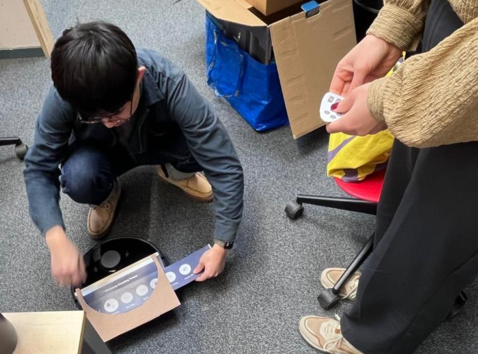
To gain a first impression of the product. We want to have the experience of using the product for the first time as a user. We also want to find out the good points and initial problems that we may encounter which we could validate in the later evaluation process.
In a group of four, we all started out without knowing anything about the product to avoid assumption bias. One person oversees recording the process. And we also took notes when we found insights. After the experience, we analyze the data by selecting interesting clips from the recording.
Result (The most valuable insight was marked in red.)
2. Heuristic Evaluation
For this heuristic evaluation, the 10 usability heuristics of Jakob Nielsen (Nielsen & Molich, 1990) were used as a guideline for finding usability problems. These guidelines are based on human behavior, psychology, and information processing.
To get a clearer insight into when problems occur and to make reviewing the product more manageable a set of 4 tasks was designed. These tasks are the basic tasks a user of the Philips Homerun 7000 Aqua performs when they first use it. The setting up task is something that is only done once while mapping, cleaning, and scheduling are tasks that the users are likely to do more often while using the Robot vacuum.
Result
Visibility of System Status
The design should always keep users informed about what is going on, through appropriate feedback within a reasonable amount of time.
User Freedom and Control
Users often perform actions by mistake. They need a clearly marked “emergency exit” to leave the unwanted action without having to go through an extended process.
Flexibility and Efficiency of Use
Shortcuts may speed up the interaction for the expert user so that the design can cater to both inexperienced and experienced users. Allow users to tailor frequent actions.
3. App Usability Test
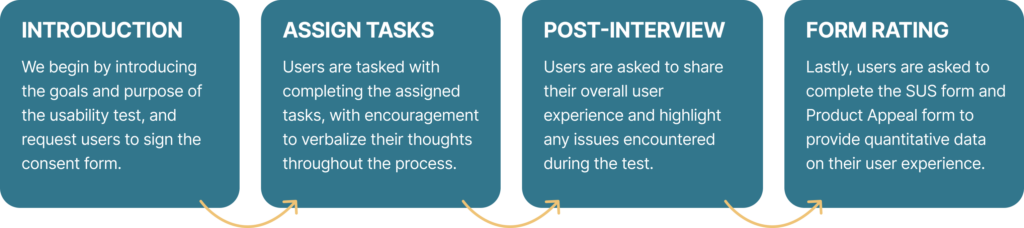
To gain deeper insights into the issues users encounter while using the system, we conducted a small-scale but high-quality usability test in a lab setting. The purpose of this user test was to gather empirical data on how users navigate the app to complete assigned tasks, identify any aspects of the app that hinder their experience, and collect systemic feedback through a structured form.
Lab Setup
Participants
Number of Participants: 6
Age: 22-27
Test Procedure
Assigned Tasks
1. Rename the Product
Users are tasked with renaming the robot, even if the setup has been completed prior to the test, to assess their ability to customize its settings.
2. Edit the Map
Users are required to mark ‘no-mop’ and ‘no-go’ zones on the app’s map.
3. Silently Clean Room 1
Users are presented with a scenario: they need to use the robot for cleaning without disturbing their sleeping roommate.
4. Buying Replacement
Users are asked to check the status of the robot’s components and attempt to order a replacement through the app.
5. Ask Robot Move to the Spot
Users are instructed to control the robot to move to a designated spot for cleaning without physically touching the robot.
6. Making Schedule
Users need to create a schedule in the app: clean the room according to a set schedule, with the exception of Thursdays at 21:00.
Result
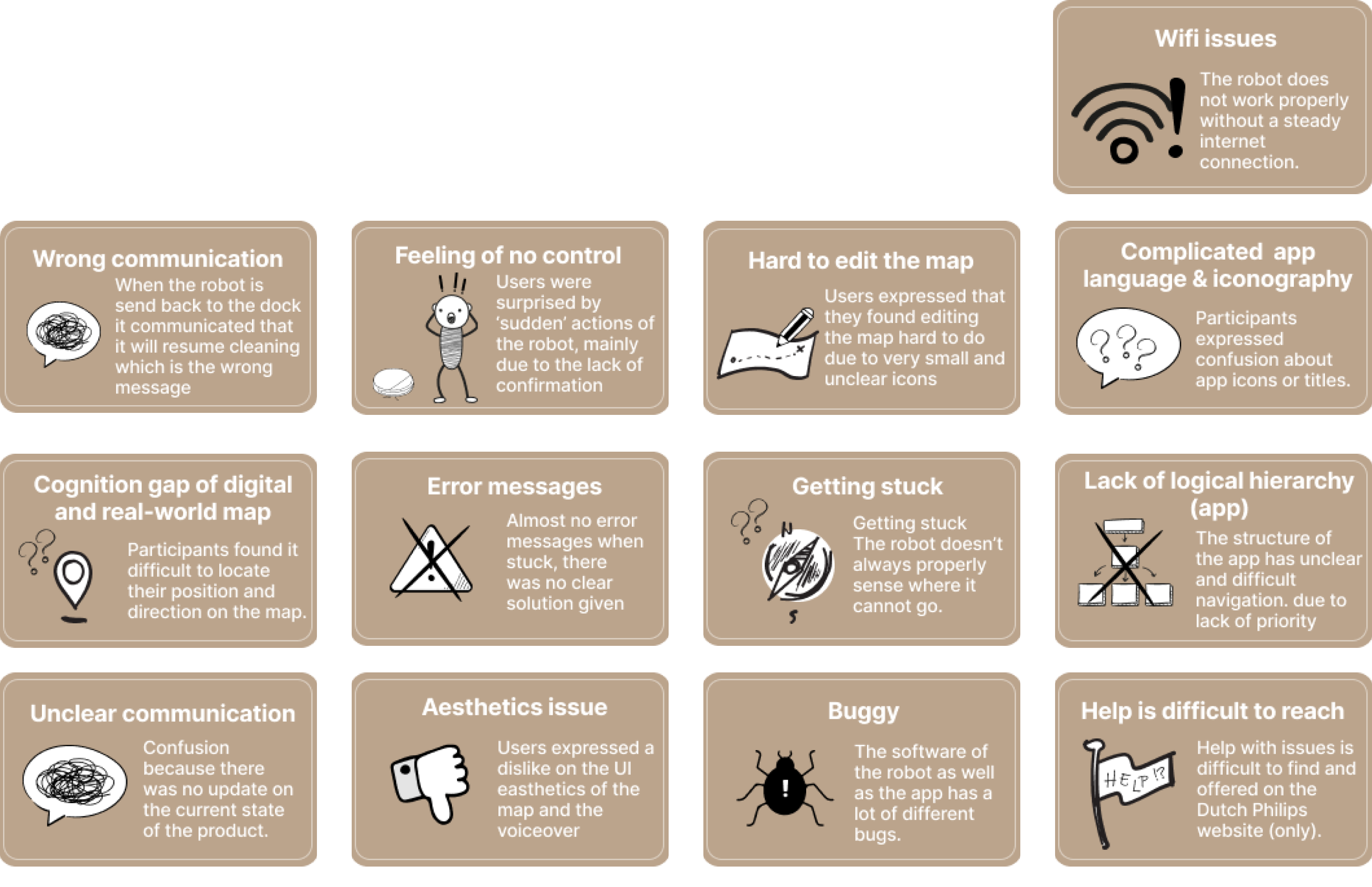
We have analyzed the usability issues encountered by users and grouped them to identify the most common issues throughout the user experience. Below, we summarize the following topics in the order of commonality observed throughout 6 usability tests:
Evaluation Summary
Issue Cards
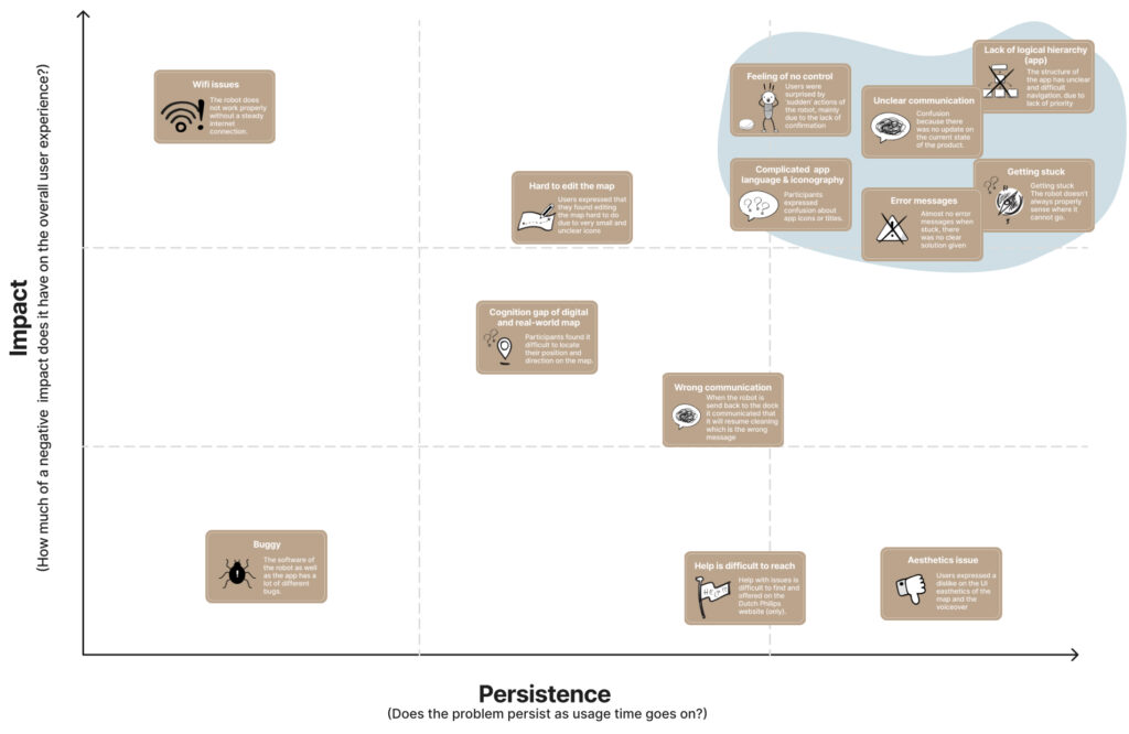
With all planned evaluations complete, all issues were identified. In order to have a clear overview of what types of issues there are this huge pile of issues was clustered. This resulted in a set of 13 issue cards.
Now that the problems are clear the issue cards can be ranked according to relevance.
Rating Issue Cards
To know which issues we should focus on for possible redesign, there should be more understanding about their impact. With the impact we mean how much of a negative impact the issue has on the overall user experience? Another thing that is relevant to know is the persistence, Does the issue persist as usage time goes on? Based on this a persistence-impact diagram was made in which the issues were rated.
The issue cards that are in the top right corner have the most impact and the highest persistence, therefore these problems have a high priority for the redesign.
Design Brief
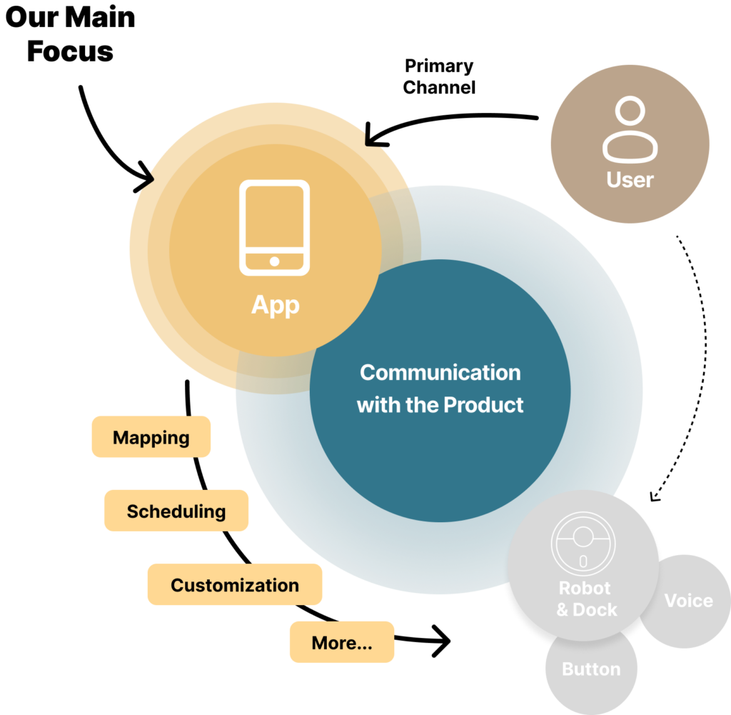
Our design will focus mainly on improving the App, the primary and more visible way of communicating with users, while not excluding the physical product’s features, like physical buttons and voice alerts.
Design Goal
Our design goal is to help users who aren’t very tech-confidentcommunicate intuitively and efficiently with the robotwhen they want their home cleaned.
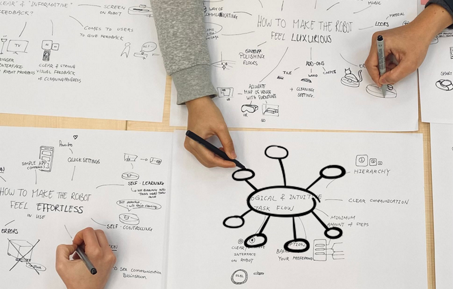
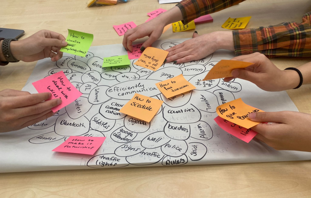
Based on the design brief, we have established a clear objective for concept generation in Phase Two. During this phase, we employed two primary methods to foster creativity while addressing the specified problems and the established criteria.
Qualities Brainstorm
Creative Session
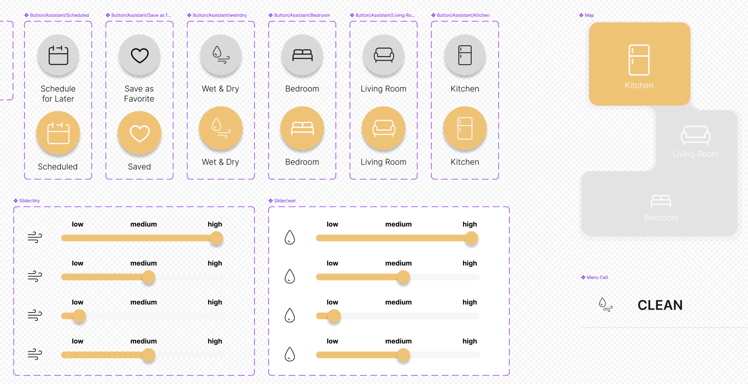
Prototyping
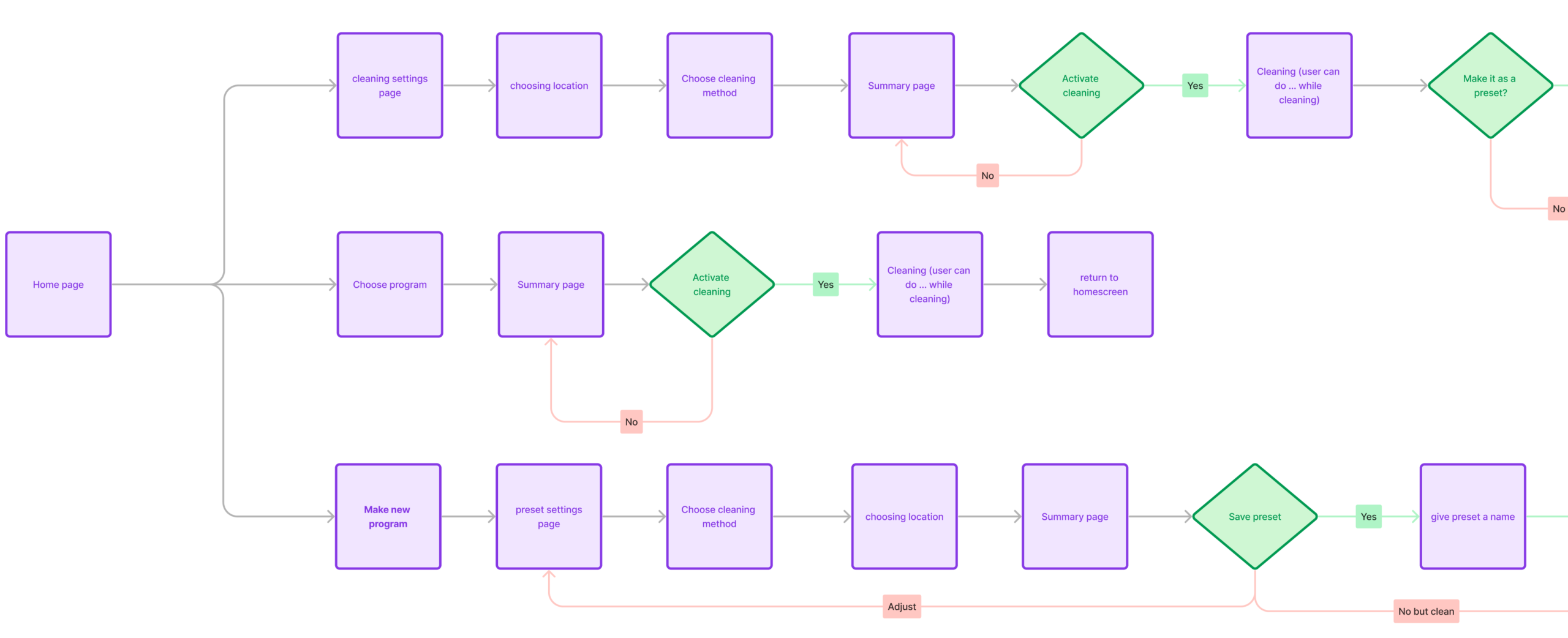
User Flow
Variables
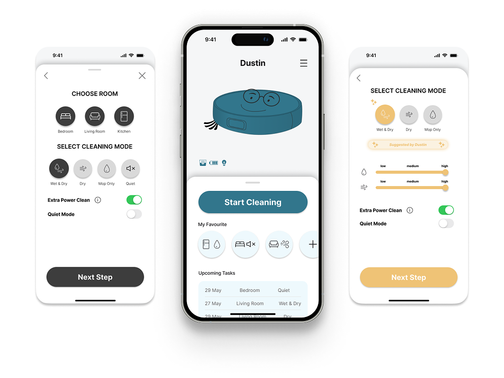
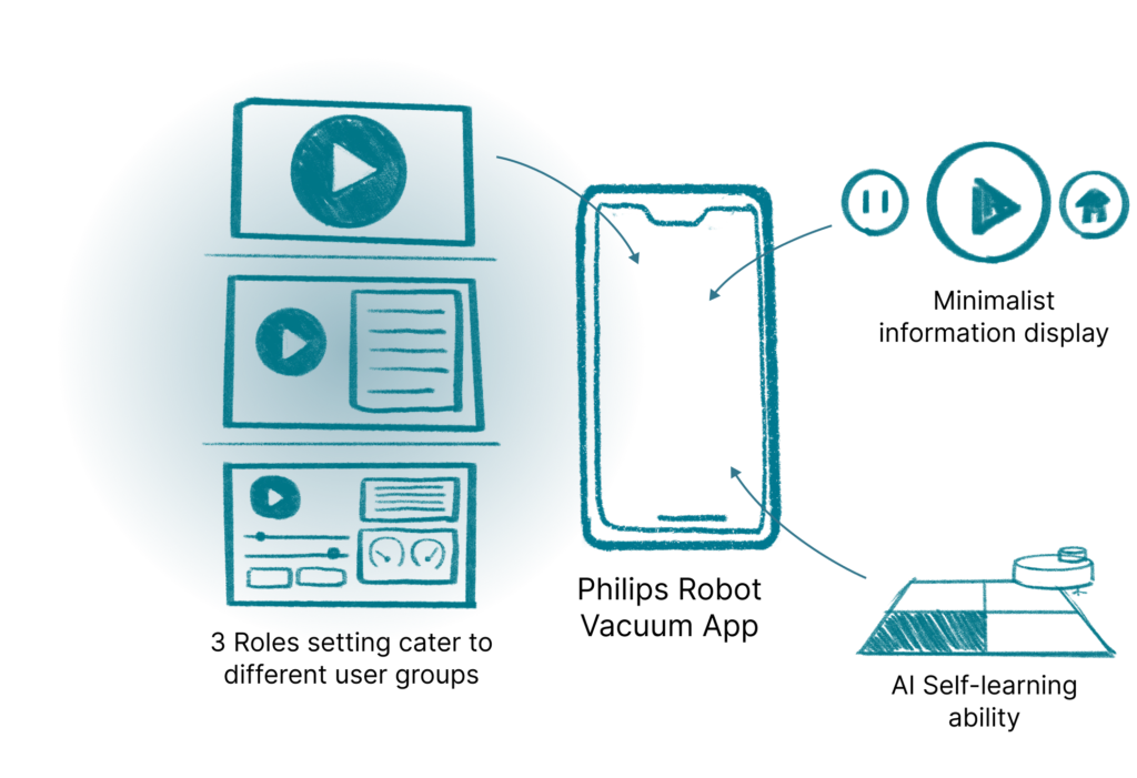
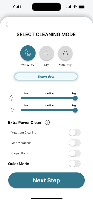
Final Design Concept
Design Challenge
Ensuring ease of use for complex features without "dumbing down" this high-end smart robot vacuum.
Design Strategy
We recognized that a "one-size-fits-all" approach would fail to meet diverse user needs.
Introducing "Three Distinct Operational Modes "based on varying user preferences and control needs.
Prototype & Test | Prototype & Test | Prototype & Test | Prototype & Test | Prototype & Test | Prototype & Test | Prototype & Test | Prototype & Test | Prototype & Test | Prototype & Test | Prototype & Test | Prototype & Test |
Redesign Evaluation
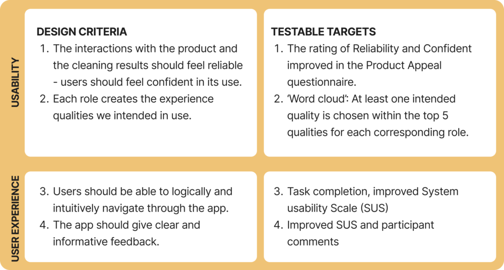
The goal of this research was to improve the user experience of the Philips Homerun 7000 Aqua Robot Vacuum. To be successful, the redesign of the app interface should attain the design criteria we formulated based on our analysis of the product in Phase 1.
Test Setup
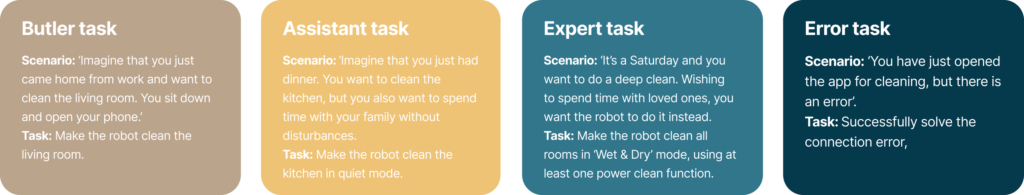
Participants were tasked with completing four tasks to assess the testable criteria we formulated to assess our final prototype.
Participants
Number of Participants: 8
Age Range: 22-27
Gender: 6 Female, 2 Male
Test Procedure
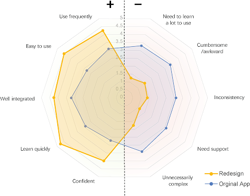
Result from Redesign Evaluation
Redesign App
86.88
Original App
45.00
System Usability Scale (SUS) score, improved from a poor rating of 45 to an excellent rating of 86.88.
Validated Needs of Different UX Flow for Different User Group’s Preference
Among the eight participants, we identified the need for designing varying levels of easily controllable functions on the interface.
Clear & Well-structured UX
Participants felt that the new UX design was well-arranged, with a proper hierarchy that successfully helps users control the app to start cleaning.
Smooth User Flow
Overall, the new cleaning setting flow has made it easier for users to initiate cleaning tasks for the robot.
App Being Informative/Motivating
Thanks to the plentiful suggestions from the app, participants mentioned that they felt motivated to likely clean their houses more often.
Relieving Cognitive Loading
Overall, the new app layout with minimal information has lowered the barrier for users to initiate cleaning tasks, especially when a lower cognitive load is required in certain contexts.
Unclear Functions Distinction between Modes
Two participants mentioned that the meaning of different colors was unclear, as were the functional differences between the assistant and expert modes.
Unmatched Aesthetic of App & Robot
Participants expressed that the app’s style did not yet align with the robot.
AI & Boundaries
Two participants expressed concerns about data collection and its usage with this product.
Feedback on Partial UX Complexity & Confusion
Some participants found parts of the cleaning setting experience unintuitive, particularly when choosing rooms for cleaning.