2023
Taipei Metro ‘We’
Metro App Redesign Proposal
2023 Taipei Metro 'Go' Hackathlon
To underscore the significance of the metro app as a facilitator for tourists, we have redesigned its user flow and interface language, providing an intuitive and aesthetically pleasing user experience.
In Collaboration With
Yu-Jie Chen
Background
Tourist-friendly Roaming
For two team members who used to travel abroad frequently before the outbreak of the pandemic, the subway app was the most important route planning assistant for tourists. As unfamiliar tourists, they hoped to obtain detailed information before their travels and be able to easily navigate during their journeys.
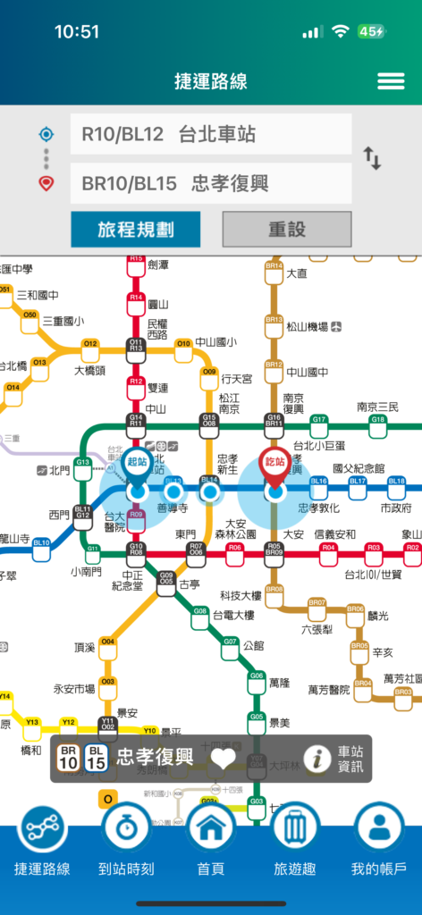
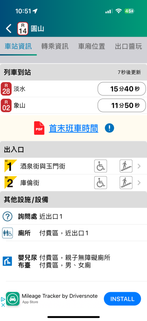
Current Taipei Metro 'Go' App
However, the current Taipei Metro Go app has some room for improvement in terms of information planning. For example, the homepage layout does not allow users to quickly find the most important route planning functions intuitively. Additionally, detailed train and station information is buried within buttons that are too deep and small.
As individuals who have an emotional connection to Taipei, we hope to optimize the Taipei Metro Go app. This would enable passengers who have never visited this city before to seamlessly integrate into the daily life of “Metro passengers” and witness the beauty of Taipei.
Targeted User Groups
Visitors who haven't been to Taipei
Visitors who needs to search detail info in advance / right now
Design Direction
By adjusting the information hierarchy and incorporating modern UI design elements, we aim to optimize the existing Taipei Metro Go app. This will provide users with a more intuitive and seamless operational experience, allowing them to explore Taipei effortlessly with just one app.
User Flow
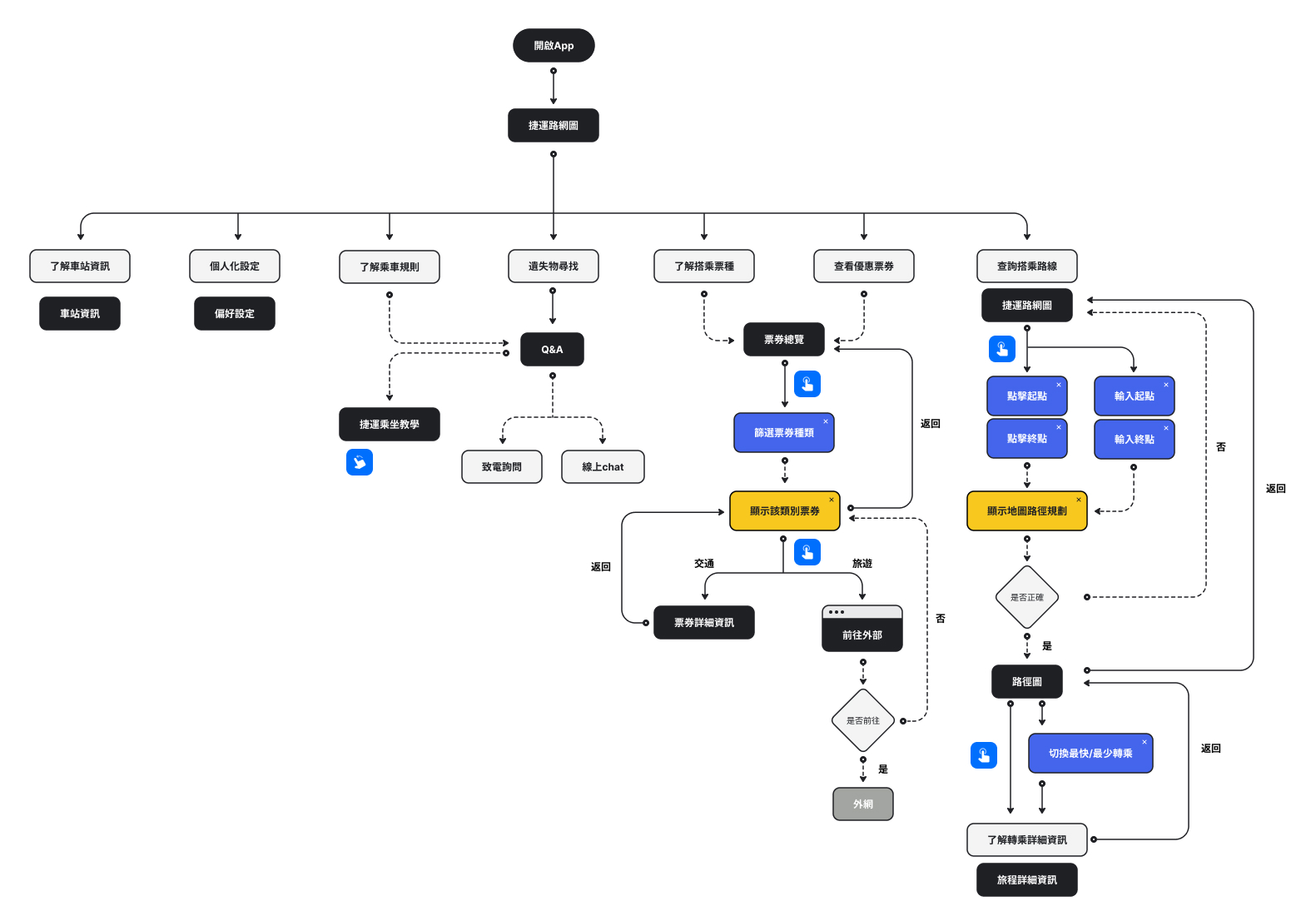
Route planning, the dominant feature of this app, remains at the front page.
We suggest two options of the route for visitors: the fastest and the least number of transfer.
For facilitating tourists, we create a ticket section displaying options of day pass.
We design a session demonstrating tutorials of taking Taipei metro step by step.
Final Design
Feature 1
Route Planning
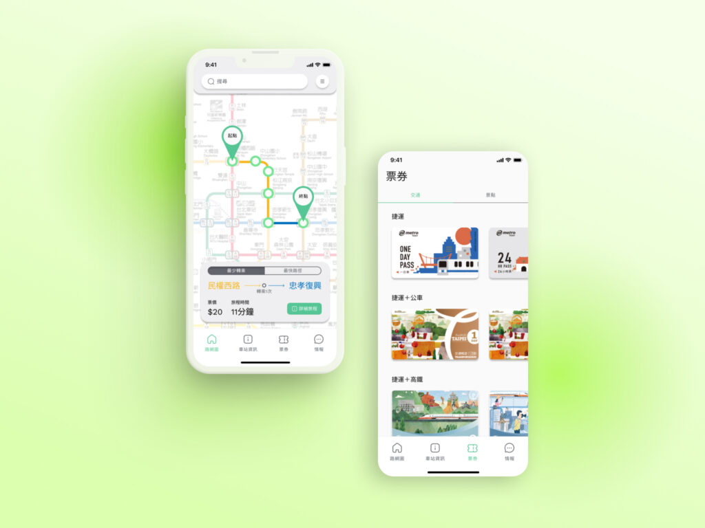
Upon entering the homepage of Taipei Metro Go, the subway network map serves as the primary visual interface. Users can directly click on station names on the map or enter station names in the “Search” bar at the top. Once completed, the map will display the planned route and a summary of the journey. Clicking on “Detailed Journey” will show more comprehensive travel information. The UI representation of train crowding on Taipei Metro Go has been updated to use a “gradient thermometer,” providing a more intuitive display of carriage crowding density.
Feature 2
Check Station Info
Users can utilize GPS to locate the nearest station or input the desired station in the search box. For users using GPS positioning, stations closest to the user will appear sequentially. Clicking on a station will display essential information such as simplified first and last train schedules, real-time weather information, live train arrivals, exit information, and station facilities.
Feature 3
City Tour Facilitator
The ticket interface is divided into transportation and attractions sections. The transportation page includes tickets for the metro and other public transportation services. Clicking on the ticket icon will display detailed information about the ticket. The attractions page categorizes various attractions for user selection. Upon entering a category, users can choose their desired attractions and then click on the icon to read relevant information and explore recommended package deals.
Feature 4
Metro Latest Info
Users can access the latest announcements from Taipei Metro and a column specifically designed for out-of-town travelers on the metro information page. We provide step-by-step instructions on riding Taipei Metro through photo or graphic illustrations, allowing travelers to fully grasp the process before their journey and enhancing their engagement with Taipei Metro Go.
Due to time constraints and our existing knowledge limitations, both of us viewed this project as a great opportunity to hone our UX/UI design methods and skills. Despite the considerable amount of work remaining, including thorough contextual research and user test evaluation, this project continues to spark my interest in furthering my knowledge of interaction design in the future.
Although we did not progress to the final stage, I had the chance to practice facilitating flowcharts and UI wireframes, as well as designing the visual setup for the app.
